
New Features on the Horizon in the NCREN Community Portal


It likely won't transport you through space and time, but some new features coming soon to our NCREN Community Portal might seem light years away from what you've grown accustomed to since the portal's launch in 2011.
The first major change you will notice is that we take you right to your stuff. That means no more weaving your way through the list of all NCREN Community members to your own institution. When we designed the initial version of the portal 8 years ago, the community feedback we received was in favor of a more open design where much of the portal content (contacts, utilization and latency graphs, and certain ticket types) would be visible community-wide, while other content (documents and other ticket types) would only be visible to members of your individual institution. More recently, however, for a number of reasons -- the most important again being community feedback -- it has become clear that a more traditional portal focused on your own content is what you want.
Since utilization and latency graphs are overwhelmingly what most of us head to the portal to see, that is where you will be dropped off upon logging in. It's also where we focused most of our enhancements:
- New-look graphs
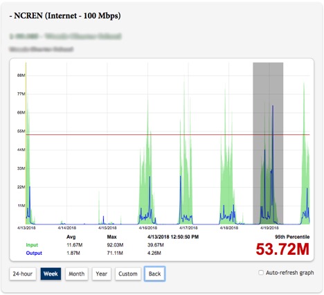
Wave goodbye to the old RRD-style graph images and an enthusiastic hello to the new interactive HTML5 graphs! They are much cleaner, larger and better at highlighting what most of us care about: the 95th percentile. - Drag to zoom The utilization graphs will allow you to zoom in on a custom time frame by simply dragging your mouse across an area of interest on the graph. So, if you see a spike in utilization that requires a closer look, you no longer need to try to figure out the appropriate start and end times to plug into the custom date calendars. Instead, just drag your mouse across the spike to zoom in on it, and continue to do so until you find what you need. Zoom too far? There's a Back button for that!
- Easy access to point-in-time data
Need to know the exact time or magnitude of the spike? Just hover your mouse over that point on the graph and see the values just below the graph. - Enable/Disable auto-refresh
The initial version of the portal auto-refreshes all utilization graphs every minute unless a custom time frame is applied. This may not be desirable in certain cases, so we've disabled auto-refresh by default but allowed you to check a box to enable it as needed. - Group graphs by service
The initial version of the portal groups utilization graphs by circuit, but if multiple circuits are used to provide a single service, then you may have to scroll to different points within the page to get a picture of what's going on with the service as a whole. In the new version, all graphs relevant to a particular service will be displayed within a container showing information about that service, including the type of service (internet, transport, etc.), the contracted bandwidth for the service, and the name of the site being served by the traffic represented in each graph. For internet services provided via multiple circuits, we will also be showing a graph of the aggregate traffic over those circuits for easier comparison against the service's contracted bandwidth. - Only the first service expanded by default
For institutions with many services and circuits, having all but the first service collapsed by default will allow the graphs page to load significantly faster and make it much easier to navigate to a particular service of interest within the page. - Latency graphs per site, embedded within the service
Latency graphs will no longer be shown on a separate tab with nothing linking them to their respective services. Instead, below most utilization graphs (those where we have a managed endpoint or pingable IP address for an unmanaged endpoint on the "far" side of the circuit) you will see a "show latency" link to display the latency graph relevant to that site being served by that service. - Data center utilization graphs
Institutions to whom we provide data center services (managed hosting or colocation) will be able to view and interact with their relevant utilizations graphs right alongside their NCREN network graphs.
A third major change is that the monthly NCREN reporting (uptime, etc.) that we provide currently through our enterprise wiki, EdSpace, will instead be served up within the portal to better consolidate important data about your NCREN connectivity into one place. The biggest benefits here are that community members will no longer need separate login credentials for accessing the portal and monthly NCREN reports, and that we will have historical reports and live data side-by-side in the portal.
It is our hope that these changes will improve your ability to interact with the data related to your NCREN and MCNC Data Center services in more meaningful and efficient ways. Stay tuned for other planned enhancements as we look to take you deeper into the data!


